
Unreal vs Unity: A key UX difference
There is an interesting difference between the hotkey editing workflow of Unreal and the hotkey editing workflow in Unity. It is very easy to see, and we can get through it in just a few screenshots. Here is what the user interface looks like for Unity’s hotkey editor:

It gives you an immediate visual overview of what keys are currently in use. It uses the known keyboard layout to show this to the user, though it does miss a numpad section. It shows you with colour, in the top right, what kind of hotkey is assigned. I am hovering over the F6 key with my cursor, and it shows me what that key is assigned to. It has a dropdown in the top left for the default hotkey profile, and allows you to make different hotkey profiles. I am unsure if anyone would need that though, unless the Unity installation is on some computer that is in a ‘hot seat’ configuration where multiple people switch between using it.
It has a little search bar in the middle right in which you can type the command to see what hotkey it uses. However, you cannot type in the physical key to see what commands use that key, so typing ‘Shift’ gets you no results. It has a menu on the left to go through the different categories, and lets me edit the hotkeys with the table on the right. Apart from the little middle right search bar being in a strange location and causing a lot of dead space, this looks neat!
Furthermore, if I hold a particular modifier key like Shift, the keyboard lights up differently to show what commands use the Shift key as a modifier:

And it also does this if I hold multiple modifier keys at the same time, like Shift and Control:

That is really neat! I think it would be great if the bottom part also updated to the available keys when holding a button. The visualization really helps give you a clear overview of what is and is not in use, and you simply hover over keys to find out what they do. This kind of visual working is, in my experience, almost always better for users. Especially when the visual layout represents the physical layout, like a keyboard.
For example, if you regularly type on your keyboard, or have to often enter in a security code on a physical interface, do you really know or look at what keys you are pressing? I think we have all had the issue before where we do not remember a security code, but when we are physically in front of a device with a numpad, we can enter it right away. Muscle memory wins out! So if you open up this menu in Unity, instead of thinking about what keys you press, you simply muscle memory your way to the hotkeys you are used to. That way you can easily check if those keys are assigned to the commands you are familiar with.
That is useful especially if you often have to switch between different digital content creation (DCC) tools. Particularly Blender has its very own unique set of hotkeys, and even between Maya and 3dsMax, both owned by Autodesk, there are differences.
Back to the Unity interface: There is also a ‘Binding Conflicts’ section, so that you can see a single table if any commands have the same shortcut. However, it seems a bit overkill to have that as a section, as when you accidentally change a hotkey that is the same as an existing one, you already get a warning first:

And if you still click ‘Create Conflict’, there is a little yellow warning sign that then shows up next to the functions that have a conflict. However, that warning sign has a white exclamation mark on a bright yellow background, so it’s hard to see it is a warning, and just looks like a yellow triangle:

So while the option to only show a table of binding conflicts quickly sounds neat, it seems a bit overkill considering the two other features already try to prevent and warn users. All in all, it’s a solid interface. Maybe not pretty, but it covers multiple needs with a user experience that makes sense the moment you look at it. Great stuff!
Let’s take a look at Unreal:
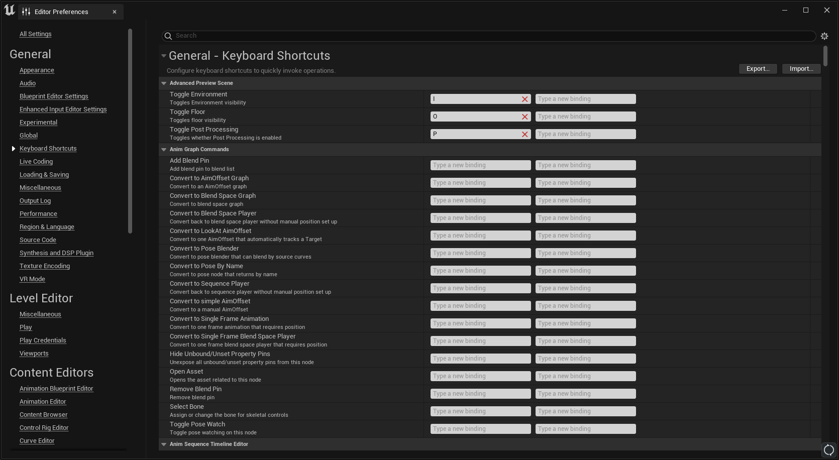
It’s a very big list. There is no keyboard visualization, and no way to quickly go between sections. You can only get through it by scrolling for a while, or collapse headers to make them smaller, and there are a lot of headers. Collapsing them all at the same time is possible, but still makes for quite a big set of headers that do not always make sense. Like for example three different sections called ‘Common’, ‘Common Commands’ and ‘Common Viewport Commands’. I am not sure a user can instinctively know in which section they have to look for a particular hotkey:

You can export an ‘.ini’ file with your configuration and import one too, which is pretty neat! There is no other quick way to switch between hotkey profiles, but again that also does not seem very necessary unless the user of this specific Unreal installation changes a lot, like in a ‘hot seat’ editing environment where multiple users are using the same computer. Which I would guess is a rare occurrence. Who knows though, maybe there is an industry in which that happens all the time?
There are also sections that I initially did not understand the use of, such as a big section that allows you to make an individual custom hotkey for every single ‘Visualize the ratio between the currently streamed resolution of texture ### and the resolution wanted by the GPU' function, which consists of 255 unique individual entries. And there is also another section with the option for 255 more unique hotkeys for 'Visualize the scale accuracy of texture ###'. So that is 510 different unique hotkey entries, which makes the big scrolling list quite big:

It is probably just autogenerated from some system wide way to make functions editable, but it still feels a bit weird that this is shown in this giant list by default. If you do use this, please let me know, as I am very curious! So far, Luis Placid mentioned to me that in a VFX workflow he has used it, though it would be for one or two particular textures, and not all of them. The same was said by Ryan DowlingSoka on twitter, who has used the functionality, but expects users to not have to use all of these unique entries, and there are other interfaces to take those same actions.
Similar to Unity, Unreal does not filter to the physical hotkeys if they are typed out into the search bar. So when you type ‘Shift’ into the search bar, you find nothing, even though there are many keys that use Shift. For Unity’s editor that workflow is partially resolved through the visualization of button presses on the keyboard, but in Unreal you don’t really get a way to see what is going on:

The commands themselves also do not always have enough names, or enough of a fuzzy search, to show up. For example, the hotkeys for flying around the 3D world using ‘WASD’ cannot be found by typing ‘W’ or ‘Fly’:

Those flying hotkeys are also not in the aforementioned ‘Common Viewport Commands’ list, and also not in the ‘Level Viewports’ list. I kept searching, and noticed something else strange. You may notice in the screenshot above there is only a single main header: “General - Keyboard Shortcuts”, which is the only one that shows up. Even if you do not search for anything, and collapse it, there is only that one:

But the moment you search for something, like ‘controls’, more of those main headers suddenly appear:

I am guessing this is some kind of bug? I cannot readily see why this would be built that way on purpose.
With this search in place though, we can now find the ‘Level Editor - Viewports’ section , but it seems it is not possible to change the WASD controls to something else here:

We can also see the controls are called ‘Flight’ instead of ‘Fly’, which is why we couldn’t find it earlier when searching for ‘Fly’. Again, a classic issue of the search not being fuzzy enough. Making searches fuzzy is necessary especially when an editor or tool is going to be used in multiple professional fields. Film, TV, Games, Architecture, Medical, etc, sometimes all use entirely different words to mean the same exact thing. I visited a home building conference expo once, and talked to the 3D tool companies there. We only understood half of what we said to one another, even though we all build things in 3D! Jargon can be weird. Even within a single professional field there can be differences between what words are used for the same concepts, workflows, and jobs. Though if this interface was organized in a more clear way with its headers, or had a keyboard visual interface to quickly check on what hotkeys are in use, that kind of fuzzy search may not be as necessary.
One big plus is that Unreal’s hotkey editing interface has way more features available for binding hotkeys to. The issue is that they are harder to find overall. While in Unity there are less options, but those options are very easily found. An interesting difference, for which you cannot clearly mark one or the other as the ‘winner’. It depends entirely on your own unique use case, but I do think we can say that for new users the Unity experience is easier than the Unreal one, and in Unreal there are more options for highly specialized professional users.
Let us look at a more direct comparison: If in Unreal’s hotkey editor you accidentally set two functions to be the same hotkey, it warns you, and asks you to cancel or override. If you override, the other function loses its hotkey, and only the new function will have the hotkey you entered:

If you do not know where the command is that now lost its hotkey, it can be troublesome to find and fix that. Unity’s way of allowing it, but visualizing the doubled up keys, makes a bit more sense in a friendly user experience way. You warn the user, allow the users to make a ‘mistake’ if they really choose to, and also make it easy for the user to rectify any mistakes later. That is a more classical UX paradigm.
In general, it seems a bit more troublesome to check on and edit hotkeys in Unreal than in Unity. I think that is mostly due to the visualization difference, where adding the keyboard layout visualization helps a lot. Which brings us to the final and most important question:
Does this matter?
From an accessibility standpoint hotkey editing is very important. It is also good for power users who want to set up their workflow in a very particular way that allows them to work faster. If there is a repetitive action that is often executed, then having the means of quickly setting a hotkey for it is helpful. We have also seen hotkeys be editable in games, for many years. For example, here are the keybind options for Modern Warfare 2, released in 2022:

In editors and DCCs we have seen hotkeys come up more and more as well over time. While Unity’s hotkeys are much more easily visualized, and easier to edit because of that visualization, is it a high priority item for Unreal to change their hotkey editor interface? It depends. Why? Because base workflows that provide the ground work for all content creation, and how those workflows interact, may be much more important and of a higher priority. That is the big difficulty of UX work, and especially Tools UX work: What can we improve, versus what needs improvement?
If much more base functionality like navigation, import/export, placing objects, lighting, scripting, debugging, performance, playtesting, etc, still need a better user experience, especially when performing a workflow that intersects those, then making the keys customizable for them would not give as much of a positive user experience impact as an individual or holistic focus on those workflows would. Hotkeys are a part of those workflows, and they are an important part, but not the critical part for any of them if the interaction with other workflows is not in a good state yet. Instead, directly focusing on making the user experience for those workflows better, would probably yield better results for the time spent developing them. If all the base workflows work well enough though, then easier hotkey editing is an incredible boon that can really speed up workflows.
An other case where it would be good to work on the hotkey editor experience is if there are enough engineers working on one particular feature, that adding even more of them can make things more difficult and time consuming to build, instead of easier. So if there is time to spare, or engineers to spare, then yes, the hotkey interface may be something good to look at, but it isn’t such a critical feature that it immediately requires change. Unreal very cleverly covers the minimum viable product (MVP) of hotkey editors: All hotkeys are exposed, they can be found if looked for long enough, and they can be edited. It isn’t easy to find and edit them that way, but it is technically possible. On the other hand, while in Unity the hotkey editor has been made much easier to work with, a feature like preventing binding conflicts has been done in three separate ways, which may instead be a bit overkill.
Also, Unreal’s technical architecture apparently automatically allows any function to get a hotkey, which is super powerful! But then the experience for setting those hotkeys is not as good. When something is technically super powerful, but hard to control, it can cause big issues that burn users. For example, something you probably have heard of before: Think of a simple terminal command that can delete the content on an entire server. That is super powerful! If the user experience is that you can just type that out and activate it without a warning though, that power is really going to hurt someone. Or another example you may have had happen to yourself in multiple editors: You can autogenerate an entirely new terrain section with a single click of a button, awesome! But if you do that, it also destructively affects any directly aligned terrain sections. Power is good, but it needs control.
Many software packages you use on a daily basis suffer from those kinds of issues, as most often the user experience is not taken into account for a final deliverable feature. Instead, whether the workflow is a blocker or not is the biggest metric taken into account. The UX-Maturity level from the NN group is a good way to understand why and how that happens. Developers, designers, and artists all want to make the best tools possible, but whether they get the time and space to do so is usually not their own choice. The same goes for whether the user experience is included in their metrics for completion of a feature. When there is not enough time or attention spent on UX, it is an issue that comes from whoever has that decision making power up top. And those at the top are often, but not always, tied to the business cases presented to them, and they align resources depending on what can provide what they need, such as growth, profit, expansion, etc. To improve a feature creation workflow so that more user friendly tools are made, you have to gather and include those user experiences and get approval from the top. Or sometimes, simply show how the current software works. Such an initial push for change always has to come from someone with the political power to make that happen within an organization. If you are not in that position, and try and push this completely on your own without support from up top, you will likely just burn out, as many folks in the user experience fields have experienced themselves.
One thing that I would still love to see an editor do sometime is improve their onboarding process for hotkeys. Blender in particular is a tough one, because on startup it will ask you what kind of hotkeys to use, and you have a dropdown between a few different profiles. One of those is the ‘Industry Standard’, which I think is a misnomer anyway, but the main problem is that if you choose that one, the documentation website of Blender can not be set to show those hotkeys. So now whenever you search for a feature in the Blender documentation, you will only ever see the ‘Blender Hotkeys’ hotkey displayed, and you will never see the ‘Industry Standard’ hotkey. A user experience is the entire holistic experience of the tools, and that includes everything around it, including its documentation, YouTube videos, forums, etc.
I think the better way forward is to make the hotkey selection workflow a bit more tutorialized when you first start up a tool, and allowing you to quickly switch back and forth to see what you like, like the very first Halo game did on Xbox. Imagine if in an editing tool it asks you to do an action, and depending on what you reflexively do to perform that action, it would set that as the hotkey? For example, it asks you to fly forward, backward, up, down, etc, and depending on whether you press WASD, and Q, E, or Z to go up or down, it sets those keys for the corresponding actions automatically the moment you press them. That way the tool interprets what you want, instead of immediately starting off with defaults that may not be good for you, or have you pick a scheme you may not know about. I think that is a much more better way forward, where the user does not have to sift through any hotkey editor interface, and the tool can more easily fit any user who starts it up, whether they have professional experience or not.
What are the main takeaways here?
Comparing tools is a fun experience.
Always ask someone to specify their jargon, especially if you work in different fields, but even if you work in the same field.
Building a user experience is about finding out what can improve, and you have to balance what needs improvement.
Power alone will not save your tools, and they have to be easy to use too. Otherwise user interfaces would not exist, and everyone would still be using terminal commands only.
If the tools you are working on are hard to use, try and get approval from up top to fix that. Do not go at it alone.
Thank you for reading! You can subscribe below to get updates when a new post is published, and you can find my talks here, and my other posts here.