
The holistic UX of integrated search filters
You open up a piece of software you have used for ages, or maybe you are just starting one up that you have never used before. There is a specific thing you want to try or do. It’s something you haven’t tried before in that software. Maybe you always used 3D geometry tools, and now want to try animation. Maybe you need to check up on a particular issue you have never seen before, because there is a particularly tenacious bug in your project you have to resolve. For example: There may be too many triangles in this particular scene. So you would like to turn on the triangle statistics to get a number. Where is the place to turn that on? Is it in the main toolbar? The general settings menu? The view menu? In the secondary 3D view toolbar? In the right click menu?
Depending on what software you are used to using, any of these can be a good guess! Whoever designed this software has to have put this in a place that makes sense, right? (If there was a UX designer working on this software anyway, but that’s a topic for another time). All those places can make sense, depending on how the designer of the software felt about what they are used to, what their users are used to, and what they figure the default should be. Maybe the default they chose fits you, and it is in one of those above locations. Maybe not, and you spend ages searching for it.
So you end up googling for it, if it is public software. Or you end up searching in Confluence for it, if it’s proprietary in-house software. On Google you get an incredible amount of results, and maybe even some public YouTube videos that are 10 minutes long, of which you really only need a couple of seconds to show you where the feature is that you need. They do ask you to please like and subscribe though, just in case they create another video that may help your exact needs at the time they send it out. It’s sadly a dead end road for both you, and them.
On Confluence you also end up not having that much success. The specific search is showing you design documents, roadmaps, meeting notes with engineering teams, etc, instead of where the feature is. All those results do make sense of course, as Confluence cannot guess what your intention is.
This is a classic problem. Both for new users of tools, as well as veterans who need to use one feature for a second. We can demand tutorialization of course, as well as having them read all the documentation. Can you expect users to read up on all these icons, buttons, dropdowns, tabs, before getting started? How many buttons are there when starting up a tool like Blender?

A lot. Even if users were to read up on all of these features (which they won’t), would they then remember all of that for the next few years as they use the tool? Unless they continually use it every single day, they won’t. Having all your users read documentation is an unattainable goal anyway. There may be complaints that in that case the users themselves are the problem, and that they are not educating themselves enough. Sure, you may find your users to be problematic then, but what is your target audience? If it includes folks who do not read documentation, and do want to create great content, you will have to meet them with good user experience (UX) design. And the target audience of users who do read all documentation is extremely small. As well as your hiring pool becoming more of a puddle.
Anyway, all of this to bring you to a solution to this particular problem. A solution that has existed for ages, and is used in many tools, but I very rarely see implemented in internal proprietary tools. That solution is integrated search filters.
“What is an integrated search filter?”
Honestly there are probably a dozen names given to this concept, so to explain it in more detail: It is a search that goes across the entire toolset you are using, and filters down to the features that are possible. So to break the name down:
Integrated: It is a part of the toolset.
Search: The user can type in what they need
Filter: It filters the results down to what the user is intending
So an integrated search filter. Is that the best name? Discussing nomenclature can lead us into hours of discussion, so for now I’ll use this one, but if there is a particular one you feel strongly about, you’re free to let me know.
All those words are a lot though. What does something like this actually look like? I think macOS and its apps have this kind of search done in a fantastically good way. For example, here is Keynote:
Isn’t that just fantastic? It opens up the menu the function is in, and highlights it. It is located in the ‘help’ section of the toolbar, and it is genuinely helpful for the user.
Just type in the feature you want or need, and it shows up for you. And because it opens up the menu, you now also know where it is, if you were to need it again. There is no need to remember where it is if you only use that particular function now and then, as you can type in your search to filter to it again.
But what if the user does not know the particular name of that particular function? Yes, that is a real problem, even in macOS. For example, ‘Spotlight’ is a search that in my experience goes over a load of different systems, including your current machine, the internet, etc. I use it a lot to find stuff on my MacBook, especially if I do not know where I left a file, or do not know where a particular macOS setting is located. It’s quite useful!
However, the below video is what happened when on my MacBook I wanted to change some of the settings of my screen. For example, whether it copied the screen to an external monitor.
The only way to find what I need and to change my screen settings is by typing in ‘Display’, which is not the first word that comes to mind in my particular brain. I am fluent in English, but nevertheless it is not my native language. Does that make a difference? Should it? Searching for ‘Screen’ and ‘Monitors’, isn’t a strange leap.
So yes, the search does also need to be made fuzzy enough so that if someone searches for a particular feature, they find what they intend. For example the Unreal editor does this really well. I think it does it out of necessity though, as in their visual scripting ‘Blueprints’ system, they use the word ‘Branch’ to describe what is in my experience more well known to folks as an ‘if statement’. So if we search for ‘if’, it gives us the result of ‘Branch’:
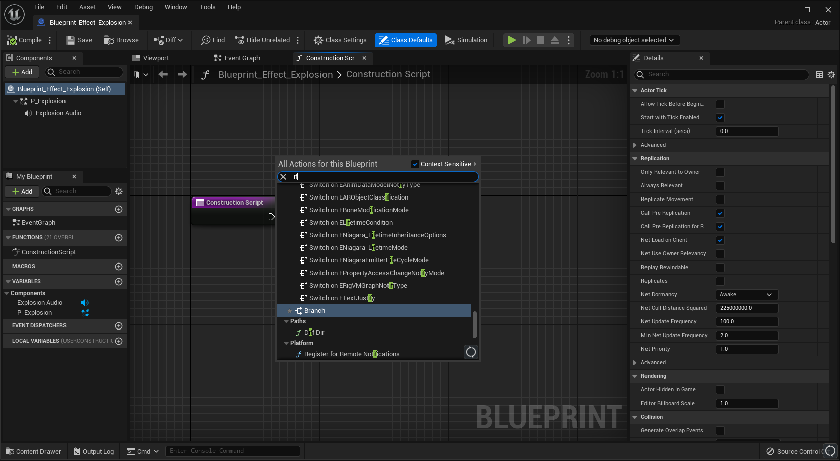
So that is a great example of a fuzzy search! You give the user what they intended, even if they use a slightly different word for it. However, there is an other place where they do not apply this. Unreal has had, since at least 2016, a difference between functions of American English and British English spelling. One case is for ‘behavior’ and ‘behaviour’:

I know it was 2016, because I posted on the Unreal forums about it: https://forums.unrealengine.com/t/behaviour-is-spelled-british-sometimes-and-american-other-times/354752 and it was sadly marked as ‘Resolved’, with an explanation of big errors and crashes being more important. Those are more important, yes, but that doesn’t mean the issue is resolved. Because the issue does make for a big difference, as some functions simply do not appear when searching with one spelling vs the other spelling:

However, the reasoning given in that forum post is correct. Renaming all those functions is dangerous and can break things. That is absolutely true, especially if it is a lot of old code. So what if instead you fuzzy the search? Make all functions appear regardless of the spelling you use? Unreal already does that. Like we saw earlier: If you search 'if', you get 'Branch'. So why not show all the ‘behaviour’ functions too, if you type ‘behavior’?
Anyway, that particular search menu is only for blueprint nodes. Not of other functionality. Unreal does have a semi-integrated search filter, but sadly it isn’t fully integrated. The search is tied to the specific menu you have open, instead of all menus.
So if you are looking for a particular function of which you know the name, but are not sure where it is located, you will be stuck typing it into each individual menu until you find it. And when you do find it, you don’t really know where it is now located, because it does not expand the menu and highlight the location of the feature. It only filters down to exactly the name you have typed in, and visually removes all other features.
Furthermore, it isn’t clear to the user that you can do this. There is no affordance that this kind of search is possible in these menus. In the macOS app ‘Help’ menu there is a search affordance by showing you an empty bar you can type into. In Unreal’s menus, there is nothing showing you that you can type to filter the options. You have to try and do it to see that it is possible. Sadly that is unintuitive if you are used to working with other software. I think most professional users would expect a keypress on your keyboard to trigger a specific command of a specific feature in that menu, like a hotkey.
What is most important about this feature though, is in the prevention of a bad user experience outside of your tool. And you don’t have to use this just for features. If you have a gigantic project, assets with many values, etc, then you can also use this kind of filtering for property panels. Have a fuzzy search at the top, so that instead of scrolling, expanding and collapsing headers, trying to find that one setting (“Is it in the physics section, or the geometry section?”) they type out what they need, and there it is.
Powerful UX, right where you need it
The user experience of your tools isn’t just located within the tools. It is also around the tools. It can be as simple as giving someone a higher refresh rate monitor, or a more ergonomic keyboard. It can also be as simple as preventing users from having to ask in Slack, search Google, or search Confluence, to find that one piece of information they need. By preventing them from having to move away from your tool, they won’t interrupt their colleagues, they won’t be frustrated by bad search results out in the wilds of Google and Confluence, and they will not interrupt their own workflow. It’s a better user experience, right where they need it inside the tool they are already using. It’s not just the user experience inside the tool that is being improved, it’s generally the user experience of working on the projects the tool is used for. As now there aren’t Slack messages about banal features, and you don’t get interrupted by someone asking where a feature is, or stuck having to search all those menus for that specific feature.
This is a real problem with many tools, with the proof available in numbers. Let’s go back to the example of Blender and the statistics. Where in all of this UI would the statistics toggle be located?

Imagine searching through all those dropdowns, settings, buttons, etc, just to try and find one feature of which you know the name. It turns out the option is located in the third dropdown of the secondary toolbar of the 3D view.

Is that a reasonable location? Sure! It’s easy to argue many other places for it too, but that one makes sense as well. Does that make it easy to find though? Depending on where you start searching, maybe not. You can also see this in the amount of views the particular YouTube videos have that explain where these statistics are located. For example this video with 94000 views. Or this video with 33000 views. They are both about the same topic: How do I find the statistics of my scene? Folks end up googling that question, instead of searching through all the available menus. Maybe because the amount of options is too large. Maybe because you find the users lazy. Maybe the tool isn’t accessible enough. Whatever the reason: It is true they can find it, it’s not impossible to find, and it’s even in a place that isn’t weird! Yet still there are so many people thankful in the comments of those YouTube videos for showing them where the statistics are.
What is a real shame though in the case of Blender, is that there is a system to search, but it doesn’t find this statistics feature. If you are on the regular Blender hotkey settings (and not the industry compatible ones), you can press F3 to open up a search menu! But if you type in there, it cannot find the statistics feature:
It’s such a shame! It does find many other features, such as ‘Add Cube’, ‘Add Curve’, etc. And there is a ‘System Statistics’ feature that shows up in the results, but that confusingly isn’t the feature for statistics of the 3D view. This search feature is so close to preventing folks from having to search out YouTube videos, or ask basic questions on forums/discords, or even just having to search through the documentation to find the exact right thing they are looking for.
Although even if they do search for ‘statistics’ in the Blender documentation, they will first get every other page that mentions the word ‘statistics’, with the result you need on how to display statistics being the bottom result.
This isn’t just an issue in Blender’s docs of course, and I do not want to single them out. Confluence, Google, YouTube, etc, all have similar issues. And again, this is with the added bonus of the user already knowing it is called ‘Statistics’. If the user does not know the specific word, they will spend some time searching to figure out what it is they are looking for. For example, try googling ‘Show triangles in blender’. You won’t get what you need, because that same question can be interpreted entirely differently.
Imagine if a user can type ‘triangles’, ‘vertices’, or ‘show me triangle number’, and the system’s search is fuzzy enough to understand what the user means? That’s improving a user experience without having to rely on outside systems. At that point, you also control the results, instead of hoping that Google, Confluence, YouTube, Discord, or your favorite forum, has their search algorithm favor your needs.
Furthermore: Having the search directly integrated also makes it so that changes automatically are reflected in that search. For example, what if a feature gets moved? In that case you do not have to manually update documentation images showing where that feature is located. (Which barely any software packages update anyway, whether they’re public or private). Instead the integrated search filter automatically reflects that new location, and shows everyone where the feature is. It saves so much time, not just for your users, but also for your own developers.
In this case I have only talked about big content creation tools, but of course this isn’t just for content creation tools. Any big complex system with many settings can have a search function if it helps the users find a specific function. The latest Call of Duty, Modern Warfare 2, has it in its settings too:
“Isn’t this a crutch?”
You may wonder: Shouldn’t all your tools’ features and workflows always work well through great design? Shouldn’t everything be easy to find through the amazing UX of your tools at any time? Sure, that is absolutely a goal to shoot for. Keep trying to reach that goal, and do not use search as a crutch to just put everything wherever you like it. Do put thought into where things get put initially. But it is also important to note that with a big complex tool you will have many users with wildly different needs, and that those needs will change over time. You will notice some features get used more than others over time, and require changes. And that you will run out of design or engineering time to create better solutions, and that realistically you cannot do everything perfectly. Strive for good, but do not endlessly chase for perfect.
Secondarily: These complex professional tools aren’t an app to book a flight on, or a website to buy goods and services. These are enormous systems with many options that allow the very creation of complex content. Your users will also be switching between multiple tools consistently, like 3dsMax, Maya, Blender, to Unity, Unreal, Godot, Confluence, Jira, etc. There are gigantic workflows all integrated within each other, where a user will spend 10 hours a day in these tools for 4 years straight to finish a project. Will you set up all your features exactly in the right location for all users, all projects, and all cases? No. Sometimes a user wants a specific thing, they cannot find it, and letting them type to find that thing is good.
Besides: You’re autocompleting your function names in Visual Studio. You’re autocompleting Blueprint nodes in Unreal. Do we expect the user to know all functions and nodes by heart? Or would we expect someone to type and autocomplete their needs sometimes, just to find that one thing? That is where integrated search filters shine brightest: Where they prevent your users from not just being annoyed, but also preventing them from getting out of their flow state.
Thank you for reading! If you enjoyed this post, you can find my talks here, and my other posts here. You can also subscribe below to get updates when a new post is published.