
The Power of Spatial Documentation
A problem that often surfaces in any project, and especially 3D projects, is that it is hard for the team to communicate to one another about the content they are making. What should go where, and why? Documentation is then created to try and bridge that gap. You simply write down what is supposed to be where, what is planned where, what works in which ways, when it is supposed to be done, etc. Maybe that is documented in Confluence. Or in Trello, Basecamp, Jira, or even channels in Slack. It can be done through text, images, videos, and graphs. All of these are good things to try and do and keep things organized, but they have the same core issue: They are all not where the actual work happens. You do not build the project, and especially not 3D scenes, in Confluence or Slack. You build them in some tool, or 3D editor like Unity, Unreal, Maya, Blender, 3dsMax, Houdini, etc.
Switching from that 3D editor to a different documentation tool causes some mental baggage. It also means there has to be some pipeline for changes to be sent through to that documentation tool when the roadmap changes. Furthermore, the user experience (UX) of the documentation tools is usually entirely different from the project tools that are being used to create the content. There are also issues of trying to search with the right names at the right times, as well as whether the search functions of your documentation apps actually give your users the results they need. When they search for a particular project area by name, will they then find the layout of the area, or the meeting notes from a discussion about that area from 2 years ago? One is useful, the other one not at all.
So, what can we do about this?
Spatial Documentation
Having the documentation in the spatial place where it is accessed and used is what resolves this problem. Over the years I have seen this approach be the one that teams naturally gravitate towards as well in early stages, but it is sometimes taken away from them by a push to classical documentation methods. That’s a shame, as the spatial documentation usually works much better. For example, the Unreal Content Examples have a great way of doing this: By showing an in-editor object in the relevant location, which you can then select, and in its properties is a link to the relevant documentation:
That is a fantastic way to work! There is no need to google with specific words that you have to remember, which is often problematic as the words can often differ in meaning depending on what jargon your specific industry uses. The question mark object is also located in the location of the level where it is relevant. So now, whenever there is a relevant documentation link in the example content, they can simply place that green question mark and have it link to the relevant page. There is no need to worry about whether the search system for the documentation tools work well or not. There is no need to worry about whether Google has changed the search algorithm for these terms. The project creators of the level have full control of what goes where, and the user finds it in the place where they need it.
Even better: It is protected from iteration! This is incredibly important, because now the documentation can change without as many issues. For example: Where the page is located in the wiki can change. The name of the page can change. Because none of those things are used by the user to find the documentation. All they have to do is change the link that is on the green question mark object, and they’re done. You remove all the potential long term issues by working your documentation into a spatial form like this.
Of course, it does not necessarily have to link to an external bit of documentation. Since the 90s many level editors have had specific objects and entities in space for properties used by the 3D level they are in. For example, in Source engine games such as Counter-Strike or Half-Life, the entities for lighting, fog, color correction, etc, are usually all placed in one central location. This way the properties can easily be found, and anyone can find where they are. No need to go through menus, or finding the right tab out of 20 for the information you need. Instead it’s right there in 3D space, like here in de_dust2:
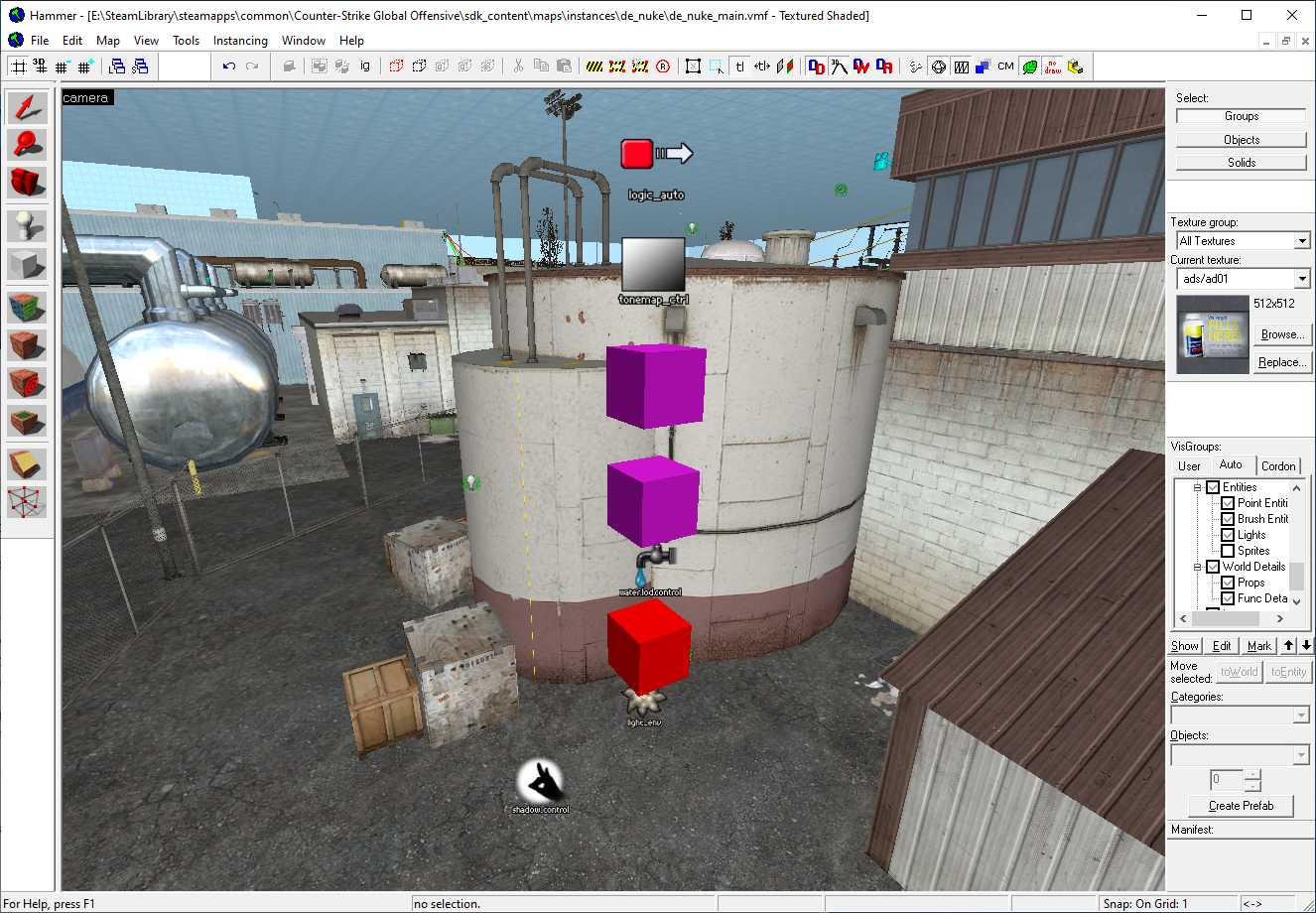
This way of working is slowly fading out, which I think is a huge shame. You have to find specific scripts and visual scripts either in an overpopulated asset browser in which things are hand to find, or the settings are in increasing esoteric menu locations. The same solution is also in the de_nuke map of Counter-Strike: Global Offensive, with its global map entities in one place:
Having the properties and content located in space, whether it’s 2D or 3D, makes them easier to find. This is due to the work being spatial, so everyone working in that spatial system can easily find and see what is going on. For example, imagine if a particular script for a cinematic or non-playable character (NPC) interaction is exactly in the space where it would trigger. In that case, nobody has to find out what script is triggering the specific situation, or try to remember the name of that script, etc, as they can simply fly to the location where the cinematic is in space, and then take a look around there to find what they need. If the location moved, you would find it in the asset browser first, to then let it take you to the location in space. A two way street is much better here.
It does not only have to be entities or documentation links though. Another great example of this is literally putting the information inside the space with text. Of course this isn’t baked into the final product, by either hiding it in a ‘debug’ layer, or some other way that keeps it from the end user.
Let’s say you have a huge fantasy world, but it’s still being built. The names of cities and locations are not established yet, and may change over time. Would you require your developers to constantly go back to the documentation websites to see what things are, and what needs to be placed where? It’s a barrier to overcome, as again it can be difficult to find what you need, and you are now forcing the user to switch between apps. It is an error prone process. Instead, let’s put the location info right where it needs to be used:
No need for everyone to constantly check external documentation. No need to ask your co-workers what is where. If you come back from vacation and a bunch of things have changed, such as entire locations of cities, you can simply open up the editor and see that. If the name of a city changes, or if it’s removed entirely: No problem, just go take a look. And who will update this content? Those who work in it, and are used to the UX of that tool.
Yes, we could require everyone to read their e-mails extremely carefully, make them pay attention in all meetings at all times, and keep up to date with everyone’s changes. Is that realistic? What if someone is sick for a day, or on vacation for 2 weeks? What if the project is so ridiculously huge and complex that it is hard to keep up with what is going on? These are normal problems to have. Ignoring them, or trying too harshly to prevent them, will just make the eventual work harder for everyone. Instead, understand that the problem will happen. We are all human beings, so we will not be perfect. Make workflows that allow for ways that easily resolve these problems when they do happen. Because it’s when, not if.
The same goes for smaller locations, and also smaller situations. Let’s say a city isn’t built out fully yet, but people are already working in it. Do they constantly check a 2D map on some documentation page, which they then constantly need to manually update to make sure it fits the latest designs? What objects are they allowed to move around and change if their area is being iterated? Or do you simply use spatial documentation, in which case everyone can see what is going on in the blink of an eye?

Will someone read an e-mail and remember not to move or edit the location where cinematic #2 takes place? Or will they see the big red box with big letters telling them not to move it? If you remove the barriers of having to search and find documentation, it becomes much easier for anyone to stick to the documentation. Having the documentation spatially, in a place and tool that the developers are used to, is a good way of doing that. They are already used to the UX of that tool, so they can easily use it. The image above is not an email about 'Dont move cinematic 2_3b_v2' that nobody is going to be reading anyway, but instead a real and actionable bit of information in the location where it is relevant.
It also makes things much easier to find, in a spatial way. Think of yourself entering your local supermarket. Do you know all the exact names of all the exact items you need whenever you enter the store? Or do you go to the bread section, the cookie section, etc, to get what you need, and then grab what is visually recognizable to you as the item you want? I think as human beings we have a much better spatial memory of where things are, than knowing the exact directory listing of where an asset might be. How about instead of tickets spread around in Jira, and inside various increasingly difficult to understand Epics, there are notes and links inside the level that tell the developer what is wrong? A missing collision block here, a nav generation error there, etc. Seeing that spatially inside the area is a lot more helpful in the blink of an eye. Much better than starting off with a giant list of text on a separate website.
Imagine assets with notes attached to them inside the tool the project is built in, so anyone can quickly see what things are for, or if there is anything they need to know about the asset. That still requires upkeep, but it's inside the very tool you're working with instead of separate. One interesting case is ShotGrid, which is powerful for all kinds of content, in that it allows notes, dates, suggestions, data, etc. All of that is inside it and you can relate it to assets, as well as projects in general. There is also integration possible with some other tools. It is a great improvement, and very useful, but full integration within one tool, with similar UI and UX, is often still not quite achieved. You may still end up with content being in e-mails, on an in-house wiki, in ShotGrid, in Perforce, in Slack, etc, all disparate with your developers having to search through each one to find what they need. If you have worked on any projects, you probably will have bumped into these issues.
Seeing what you need in the blink of an eye is incredibly powerful, especially if most of your day is spent looking at things. It helps keep users in the flow of work. It’s very similar to seeing a big purple ‘missing texture’ on an asset, or a big red ‘error’ for a missing model reference. You can see it in the blink of an eye, and it immediately informs you of what is going on. It can also be very helpful if there is a way to get a top level projected view of the entire scene, project, or world the team is working on.

It does not have to be pretty. It just has to work well enough for everyone to understand what is going on. They work in the space, so use that space to explain the space. If the text is billboarding as well, so that it always faces the camera of the developer, even better! You’ve probably already done similar things to this, with visual scripting. For example, if you use blueprints, then I hope you are also using comments to outline what sections do what:

That is spatial documentation! The documentation is exactly where the user needs it as they are using it, whether it is in 2D or 3D. Imagine if the world map above had such comment boxes as well, and little nodes that allowed you to see where quests would lead, where narrative sections are in the world, and showing you were scripts would be used. Either for cinematics, encounters, events, etc. You have done the same with regular code as well, by placing comments next to the features and lines of codes that require explanation. You didn’t start writing up an in-house wiki page about this, but instead wrote it right where it is relevant. So why would that be different for other content, such as art, design, VFX, and lighting?
Another example where this works well is in tools where users want to know about specific functions of those tools. They can look those up in external documentation, or learn via tooltips. The best tooltips I have seen are the ones in Photoshop, where a little video plays on hover. You instantly see how a particular function or tool is supposed to work, without having to read any text or complex jargon that goes into too much detail:
So again, the information that is necessary is in exactly the place where the user needs it. It isn’t only in some separate documentation website. You can still link from the tooltip to other documentation that is external and more detailed, or have highlighted words that if clicked expand to their own little tooltips with more information, etc. Keeping the core information inside the tool allows the user to keep being within the flow of work.
Besides, most users won’t read documentation. They will watch a gif though! They will watch a 2 min video. Not much longer than that. Otherwise they will open that video up, see the timeline of 30 minutes, and then decide to watch it later. Which means never. Be honest: We have all done that
The one exception is programmers. They read documentation, and really go through it. However, I believe that’s still due to bad UX and documentation issues! Every API works differently, so you have to read up on them to even make basic stuff work, or fix things, which is a huge time sink. If you have to show documentation, the best location for it is right inside the tool. Even better is if it is spatially with the content the users are using. I am specifically not saying ‘in-editor documentation’, because often times that is interpreted as: “We will include a web browser inside the tool that displays wiki pages.” which is only a very small part of resolving this problem.
This has been happening for a while
Originally this article did not include this section, but I think it’s worthwhile to also visit some past content, and some talk slides that were released on December 22nd 2022: A CEDEC 2019 talk from Michiel van der Leeuw at Guerrilla. It’s very interesting in that it too focuses on many of the same issues: Users having to context switch between different tools, giving a big 2D overworld map to visualize data on, etc. The talk has a lot of neat stuff in it that is often not yet in public editors, but is in multiple studios’ internal editors.
For example, that 2D worldmap with data to visualize information in a better way for developers? CD Projekt did this as well, for The Witcher 3, and they talked about it at GDC 2015

It isn't exactly the same of course, every editor has its differences, but the general concept of: "Show a visual representation of the world with clear markings in space" is a critical one, especially for open world games, that many studios move towards. In this case, for the Witcher 3, he talks about visualizing a lot of data points. They even find a shadow casting light that was 4000 meters in diameter! Having your content searchable and visualized in such a good way is critical for huge workflows.
There's also the great work that Peter Vesti Frendrup has done and showcased, for example for Battlefield 1, where there is a 3D heatmap of where players spend time, so you get a much better idea as a level designer of whether your level works well or not for players:

Then there's the cool stuff Alen Ladavac showed in their GDC Europe 2015 talk about the Talos Principle, where they have developers being able to create tickets right there in 3D space, so you don't have to context switch to Jira, or some other bug tracking software:

So this kind of 'Work in contextual 3D space" push has been going on for many years. And it will keep going. I am also really glad to see folks sharing their internal tools and workflows, and I hope for more studios doing it and sharing that too. But the most interesting thing to me is that this kind of spatial documentation and spatial context workflow was used back in the 90s, disappeared, and is now kind of making a comeback again.
Sometimes these kinds of workflows get shared unintentionally, when the debug information is shown after the game has released. We can still tell how useful it is to see text in 3D space though. It is much easier to see in-game than in some debug console that we may never notice. For example here, in Dead Island 2 where the text clearly explains what is going on, and what to do next:

And also this older 2D debug textual example, in the original Bioshock:
@korkyplunger I'm sorry but Paul didn't do his job... pic.twitter.com/Wvdnq4QwLr
— lordferky (@lordferky) September 21, 2016
Ghosting
Another good example of providing spatial context is 'Ghosting'. This is when you show something in-editor that provides context for something that moves, animates, or is interactive.. For example: If there is an 'emote' point for an NPC somewhere, where they would go to do a particular canned animation, such as siting down, waving, dancing, etc, then it is helpful to give that point a ghost of that NPC doing that particular action. Especially when an NPC moves a lot during a particular canned animation, this can show the level designer or artist that there is clipping. Doing it that way prevents a very time consuming and annoying workflow where the user would somehow have to get a particular NPC into that particular state to test if there is any clipping.
The same kind of ghosting is also helpful for other animated objects. This can be useful for moving platforms, debris from a canned explosion animation, and anything else that your particular project may have to deal with. Especially doors are useful to ghost, so that everyone knows where and how they swing:
door brigade with translucent ghost doors for previewin' open/closed positions pic.twitter.com/KBw12YaRQD
— Joe Wintergreen (@joewintergreen) November 1, 2018
Setting up this kind of ghosting in your toolset can save everyone who works it it a lot of time, and also prevent many bug tickets about objects clipping, NPCs looking weird or getting stuck, and players not being able to traverse.
Real life equivalent
In real life you also expect context in the place you need it, with for example a sign representing that spatial documentation. Where to go, what to do, how much something costs, etc. If you don’t see something like cost clearly displayed, you will be much more hesitant about buying it. Even the necessary air pressure of your car tires is located on a sticker inside your car door. When you go through an airport, you follow the signs, and they should be in the places you need them. Yes, there is a separate map you can download, but having the location be useable in the place where it is, is the better way of helping your users. You may be keeping notes around your desk with relevant information as well. Maybe digital notes, maybe physical, but you are not expecting yourself to always remember everything.
So the next time you’re thinking of documenting something, instead think: Where could this information best be located? The right answer is probably right next to the very content you are building.
Thank you for reading! If you enjoyed this post, you can find my talks here, and my other posts here. You can also subscribe below to get a notification when I release a new post.